

The U.K.’s new public railway has a perfectly British brand
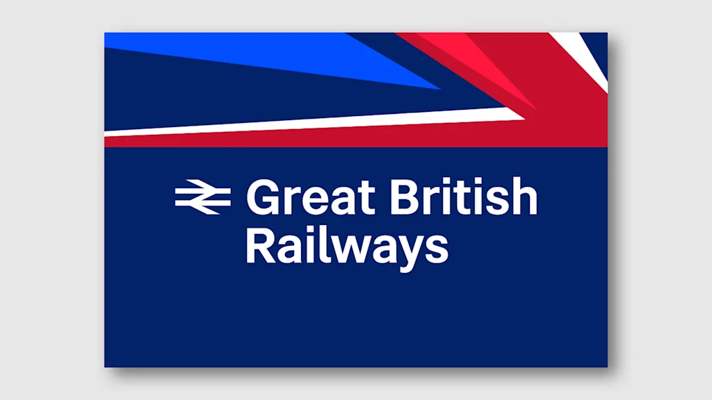
The Great British Railways has a great British brand.
The U.K.’s new public railway is leaning on well-known, classic symbolism for its visual identity unveiled this month. Train liveries for the new brand will show a design of a stylized Union Jack flag, while the new logo brings back an old double arrow concept designed in 1965 by Gerald Barney for the old state-run British Rail. The brand’s font is the simple, modern sans-serif Rail Alphabet 2, an updated version of the British Rail font designed in the 1960s by Margaret Calvert and Jock Kinneir.
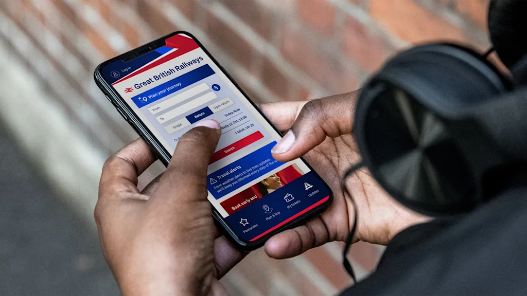
The new brand was designed in house by the U.K.’s Department for Transport and it will begin rolling out on trains, stations, signage, websites, and a ticketing app by spring 2026. The branding is an outward manifestation of a wider goal to deliver better public transportation. Already, they’ve frozen rail fare for the first time in 30 years.
“This isn’t just a paint job,” U.K. Transport Secretary Heidi Alexander said in a statement. Instead, “it represents a new railway, casting off the frustrations of the past and focused entirely on delivering a proper public service for passengers.”
A new take on an old brand
Modern, minimalist, and geometric, Barney’s original 1965 double arrow logo for British Rail used the lines and angles of the U.K. flag to cleverly communicate two-way transportation. The mark also has staying power.
Even after British Rail began to be privatized in the 1990s, the double arrow mark remained in use as an official rail symbol in the U.K. at stations and on tickets. And just as with classic mid-century civic design in the U.S., there’s similarly an audience for print standards manuals of the old British Rail brand.
The U.K. is in the process of renationalizing its railway companies following challenges like a drop in riders following the pandemic and high ticket prices. Both Conservative and Labour governments have pushed to make more of the country’s railways public, and for now, nine train operators, representing a third of all passenger train traffic in Great Britain, are nationalized. The remaining seven are expected to be nationalized by October 2027.
Bringing the double arrow logo back, refining an old, classic font, and using a flag-inspired livery design is a smart move that keeps the public’s ownership of the brand front and center with well known and widely understood symbolism. If Great British Railways can deliver on a better experience for riders, the brand could become an example of civic design and public ownership done right.