‘I wanted it to be raw’: Paula Scher explains her squished map logo
Women+ on the Edge of Democracy is an upcoming revue of 10-minute plays and monologues about this moment in democracy, as written by 36 women playwrights. The logo for initiative, designed by Pentagram partner Paula Scher, with associate partner Bruno Bergallo and project manager Olivia Ray,…
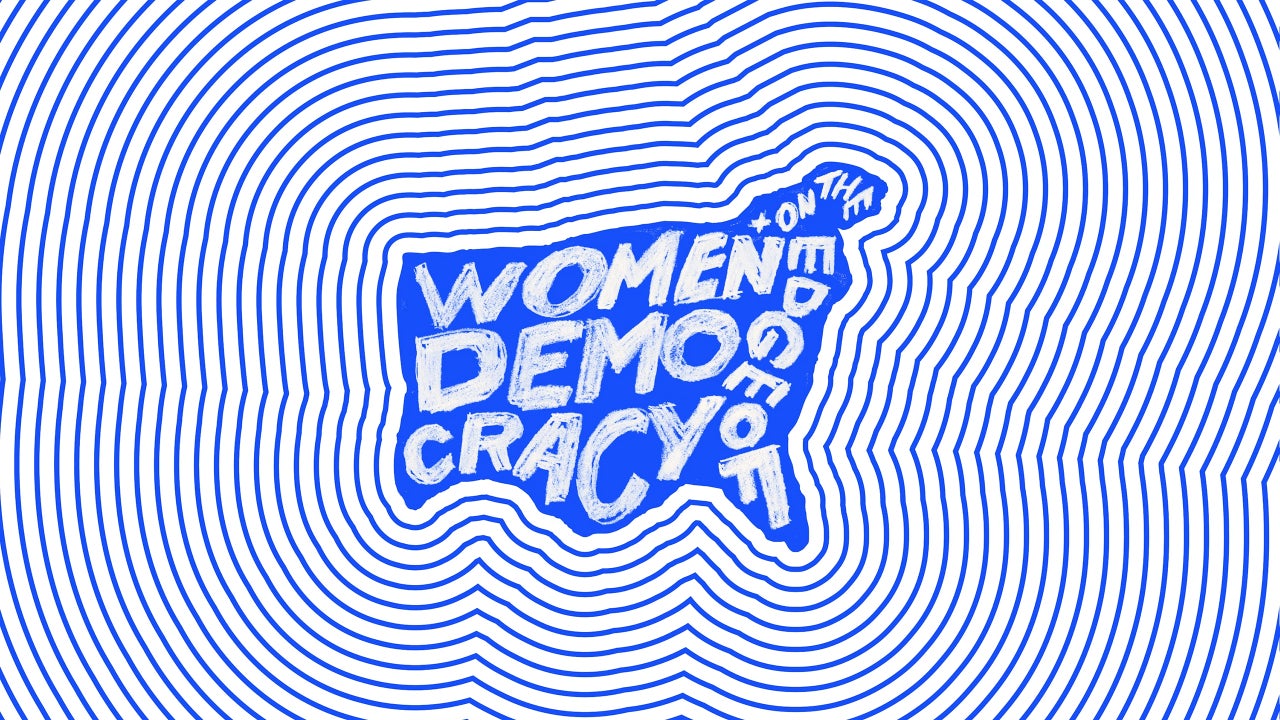
Women+ on the Edge of Democracy is an upcoming revue of 10-minute plays and monologues about this moment in democracy, as written by 36 women playwrights. The logo for initiative, designed by Pentagram partner Paula Scher, with associate partner Bruno Bergallo and project manager Olivia Ray, purposely squeezes its title into a tight frame to visualize a point.
Scher tells Fast Company that through her cramped, handwritten concept, she wanted to “imply that women are being squeezed out of democracy.”
The revue showcases that idea. That’s because all the short plays or monologues are built around two questions: What is the current state of democracy in America from a national and international perspective? And what can history, global context, or futurism offer us in this pivotal moment?

The plays and monologues cover topics like immigration, education, and gun violence, according to a synopsis, and together, they are meant to inspire the audience to question the kind of world they want to live in and then challenge them to go about the business of creating it.
Among the plays are “Maya” by Dael Orlandersmith about a custodial worker at a library New York who fights book banning, and “The Pardon,” a conversation between a grandma and an ICE agency by Jane Anderson.
“I wanted it to be raw,” Scher says of the design. “I didn’t want it to be another sophisticated, typographic use of imagery in space,” she added, noting that she thought the lettering needed to be drawn by hand.
So Scher drew the logo with colored pencil on paper in a sketch-like style. It packs the title of the revue into a shape that approximates a map of lower 48 states, but appears roughly shaped, as if made out of tears on a sheet of paper. (Scher has made hand-painted maps for years, to varying degrees of cartographic accuracy).
“Women” is scrunched on top of “Democracy,” which is split across two rows without a hyphen, and “+ on the Edge of” is scribble up, around, and down the East coast. It’s not particularly easy to read or follow.
Some iterations of the logo didn’t look raw enough, and though they tried real typography, “it just did not have any impact,” says Scher, who designed typographic visual identities for the Public Theater in 1994 and the Library of Congress in 2018, among many others. Instead, the the final lettering is scribbled in with letters that aren’t filled in completely.
Women+ on the Edge of Democracy will be performed October 23 and 24 at the Flynn Center for the Performing Arts in Burlington, Vermont, and put on by the Flynn and the Susan Smith Blackburn Prize. Organizers are also encouraging local performances of one or more of the plays with an online sign-up for people who are interested in staging Women+ on the Edge of Democracy on their own.
Originally published by fastcompany.com. Syndicated material does not necessarily reflect the views of Glamour Canada.